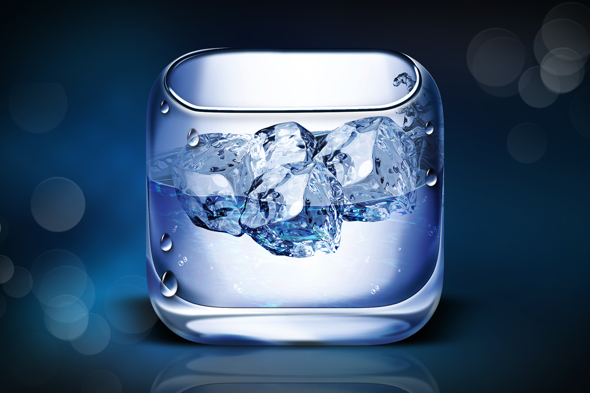
The Water iOS Icon stands as a testament to the pinnacle of ultra-realism in the world of app design. This impeccably crafted, crystal-clear icon was meticulously designed for a Hydration app tailored for the iPhone. While the app itself remained unfinished, the icon endures as a testament to unparalleled craftsmanship, radiating a sense of lifelike realism that transcends the digital realm. It’s a true work of art in the world of iOS icons.
This has to be one of my favourite and most challenging designs.


